
I am tired of observing a common statistical mistake. The mistake is simple: It’s the idea that the plot of confidence intervals on two groups can be used in place of a \(t\)-test.
To demonstrate that this practice is incorrect, we find a small counter example in R.
We can find a data-set that gives a barely significant \(p\)-value, but the errorbars on the two groups overlap. I accomplish this by doing a brute-force search for a two samples of normal data, both of size \(10\), such that the \(p\)-value of the \(t\)-test just barely below \(0.05\). Take note that the value of the significance level does not matter.
library(data.table)
library(ggplot2); theme_set(theme_bw(base_size = 15))

a <- 1

while(a < 0.045 | a > 0.05){
  x <- rnorm(10, 0, 1)
  y <- rnorm(10, 1, 1)
  tt <- t.test(x, y) # Note: Welch's p-value!
  a <- tt$p.value
}

a
## [1] 0.04669393The \(p\)-value of the test is moderate, 0.0466939. Now to graph the data. The errors bars will overlap, due to the moderate size of the \(p\)-value.
dat <- data.table(
  outcome = c(x, y),
  group = factor(sort(rep(c(0, 1), 10))))

full <- dat[, .(m = mean(outcome),
                sd = sd(outcome)), by = group]

full[]
## group m sd
## 1: 0 -0.2531200 1.2161277
## 2: 1 0.7900068 0.9404385ggplot(full, aes(x = group, y = m)) +
ggtitle("CIs overlap!", "Guaranteed when p ~ 0.05!") +
geom_point(size = 4, color = "red") +
geom_point(data = dat, aes(x = group, y = outcome),
position = position_jitter(width = 0.1)) +
geom_errorbar(aes(ymin = m - 1.96 * sd / sqrt(10),
ymax = m + 1.96 * sd / sqrt(10)))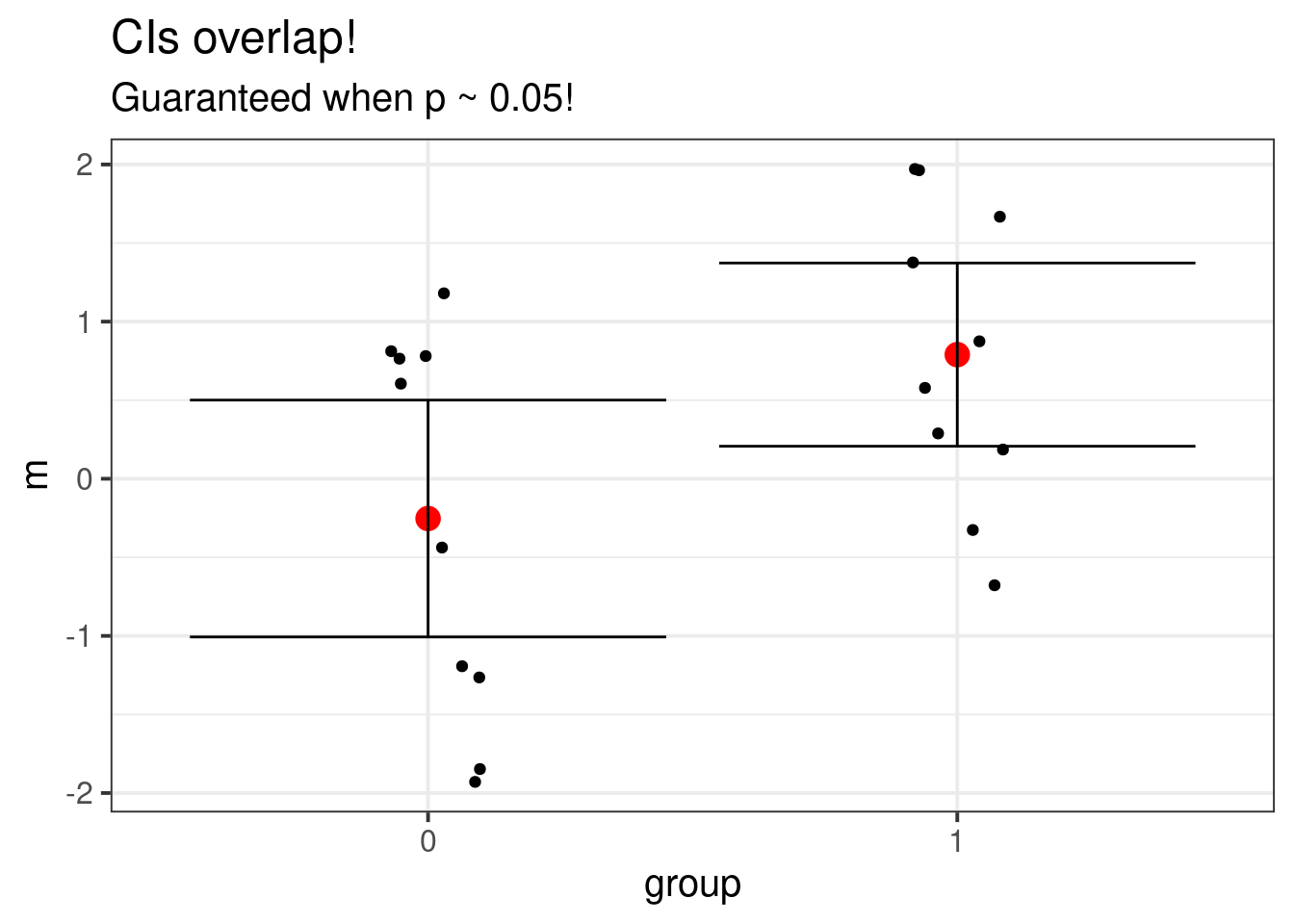
In general, if the group confidence intervals do not overlap, then the \(t\)-test will reject, but if they do overlap, we can’t say anything at all! Either way, I’d still recommend actually doing the test in addition to looking at a graph of the data.
The reason it’s not true is that the plot is misleading, despite being the intuitive thing to graph. In the plot, there are two random things being compared (the red dots). But the \(t\)-test looks at the difference between the red dots and compares the two-sample \(t\) statistic to a critical value. In this example, I used the Welch corrected \(t\)-statistic, but the principle is unchanged.
Another reason the graph isn’t true is because folks are often tricked in conventional statistics to believe that confidence intervals are interchangeable with hypothesis tests. This is true for the \(t\)-test, but the problem is that wrong confidence interval is plotted. The correct plot, which agrees with the test is,
dat_diff <- transpose(data.table(tt$conf.int))
colnames(dat_diff) <- c("lower", "upper")
dat_diff$m <- full[1, 2] - full[2, 2]

ggplot(dat_diff, aes(x = 0, y = m)) +
  geom_point(size = 4, color = "red") +
  geom_errorbar(aes(ymin = lower, ymax = upper))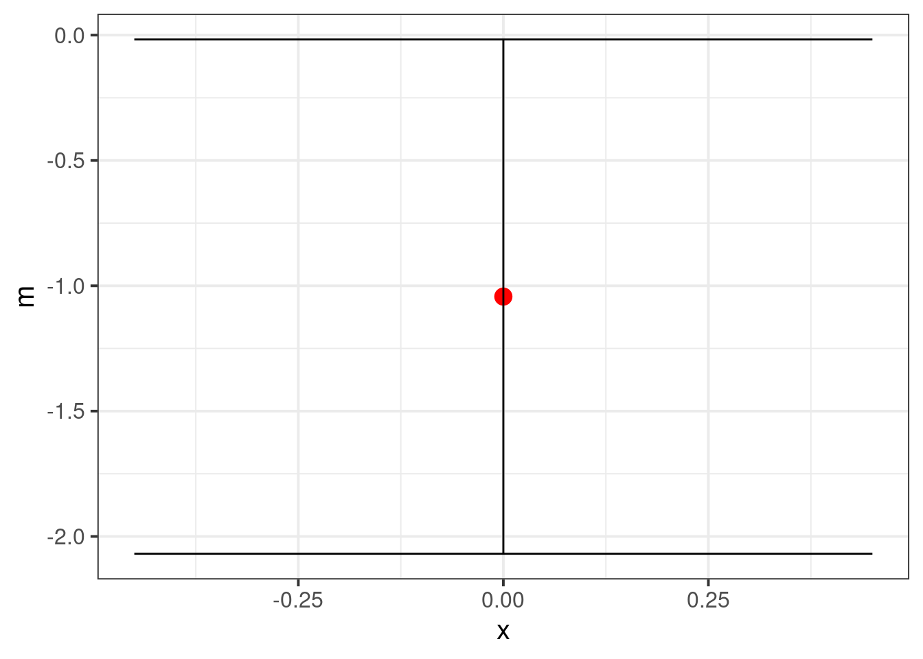
The plotted interval barely does not contain 0. We could additionally plot the differences if the data are balanced. Unfortunately, the confidence interval loses the absolute magnitudes of the raw data, so is much less informative than the first plot.
Pragmatically, it’s probably best to just use the first figure, and include the results of the \(t\)-test in subtitle or caption.