library(MASS)
library(glmnet)
library(ggplot2); theme_set(theme_bw(base_size = 15))
After seeing Frank Harrell’s discussion of the LASSO as a variable selection procedure on YouTube, I started to get curious about just how bad it might be. Link. The LASSO bit starts at around 24 minutes.
In Frank’s video, he shows a simulation that purports to show that LASSO is unsuitable for variable selection because it is too noisy.
Here was the basic idea. In the simulation, Frank set up a data matrix with \(500\) observations on \(500\) binary variables. The outcome was binary. The regression coefficients were generated under a Laplace distribution, which apparently is optimal for LASSO variable selection, but this point is not clear to me. Frank then ran the LASSO model selection \(2000\) times and recorded the number of times each of the variables were selected. The result is the following damning graph of the LASSO procedure:
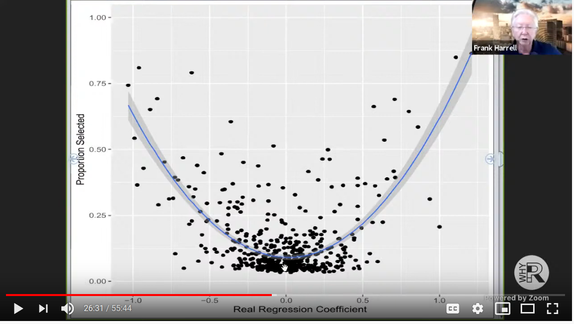
So here is Dr. Harrell’s issue given the graph: if LASSO was truly a good way to select variables, we would expect all the regression coefficients near 0 to be selected with probability near 0 (instead it is about \(10\%\)). Further all the coefficients that are outside a small neighborhood of zero should be selected with probability near \(100\%\) (instead it seems that most coefficients are selected less than half the time).
I think this is a pretty convincing argument that LASSO – which many consider to be the modern approach to variable selection – is a flawed procedure that does not possess the operating characteristics that imply reliable feature selection. (I’m sure its predictions are fine though)
Now, I don’t think Dr. Harrell actually gave the LASSO a very good shot in his example. My main issue is that he did not use a continuous outcome. Because Dr. Harrell used a binary outcome procedure, and at \(n=500\), the LASSO might not have ever had a good shot at discrimination. But I do agree that analysts over estimate their ability to do reliable model selection, and it should be avoided unless absolutely necessary.
So let’s try to redo Dr. Harrell’s simulation with a continuous outcome and see if the graph changes.
I made some key changes:
I let my factors be continuous, normal, and uncorrelated. (The last part about being uncorrelated is perhaps the most generous change)
I made the outcome a continuous Normal variable.
I did not scale my regression coefficients to have \(c = 0.8\) (I’m not sure what that means)
I should also note that I’m a glmnet beginner (just don’t have much use for it
in my line of work), so if Dr. Harrell himself were to redo this simulation for
a continuous outcome, he probably would have done things differently.
## Set up simulation

n <- 500
p <- 500
nsim <- 2000

## generate beta from a double exponential
beta <- (2 * rbinom(p, 1, 0.5) - 1) * rexp(p)

## place to store simulations
b <- matrix(NA, nsim, p)
Now run the sim:
for (i in 1 : nsim) {
  X <- mvrnorm(n, mu = rep(0, p), Sigma = diag(p))
  y <- rnorm(n, X %*% beta, 1)
  fit <- cv.glmnet(X, y, alpha = 1)
  b[i, ] <- as.numeric(coef(fit, s = "lambda.min"))[-1] # ignore the intercept
}
The simulation takes about an hour on my computer, I don’t recommend running it yourself!
# prepare to plot
perc_selected <- apply(b, 2, function(x) mean(x > 0.001 | x < -0.001))
pdat <- data.frame(beta, perc_selected)
write.csv(pdat, "pdat.csv")
Finally we can re-make Dr. Harrell’s famous plot.
pdat <- read.csv("pdat.csv")

ggplot(pdat, aes(beta, perc_selected)) +
  geom_point(alpha = 0.5) +
  ylim(c(0, 1)) +
  scale_x_continuous(breaks = seq(-10, 10, 1)) +
  xlab("Real regression coefficient") +
  ylab("Proportion selected")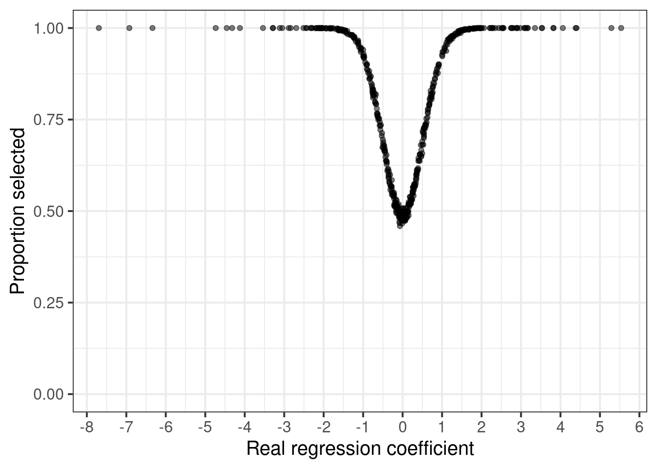
Hmm. A considerably different picture. One pattern I expected was the smoother transition in the selection probability of the variables. There is a lot less noise in my plot, which I mainly attribute to the use of a continuous outcome.
In one respect, this is a much worse picture than what was in Dr. Harrell’s graph: If my graph is correct, the LASSO only has a 50% chance of removing null effects!