
Here’s an interesting problem: Suppose you have a curve that represents the probability of an event, conditioned on some \(x\) values. It could be any curve, but we hope it is reasonably well-behaved. The \(x\) values represent an offset, some distance from a center-point, so \(x=-1\) is functionally similar to \(x=+1\).
Now, we’d like to define a typical set: a range of \(x\) values with some characteristic probability, which is the average probability on the typical set. Let’s call the characteristic probability \(a\), and the length of the typical set \(b\). How do we find a confidence region for this typical box?
A graph would be helpful:
library(data.table)
library(ggplot2)
library(rstanarm)
library(splines)
library(pracma)

options(mc.cores = parallel::detectCores())
theme_set(theme_bw(base_size = 16))

dat <- data.table(x = seq(-1, 1, length.out = 100))[, y := 1 - x ^ 2]


ggplot(dat, aes(x = x, y = y)) +
  geom_line()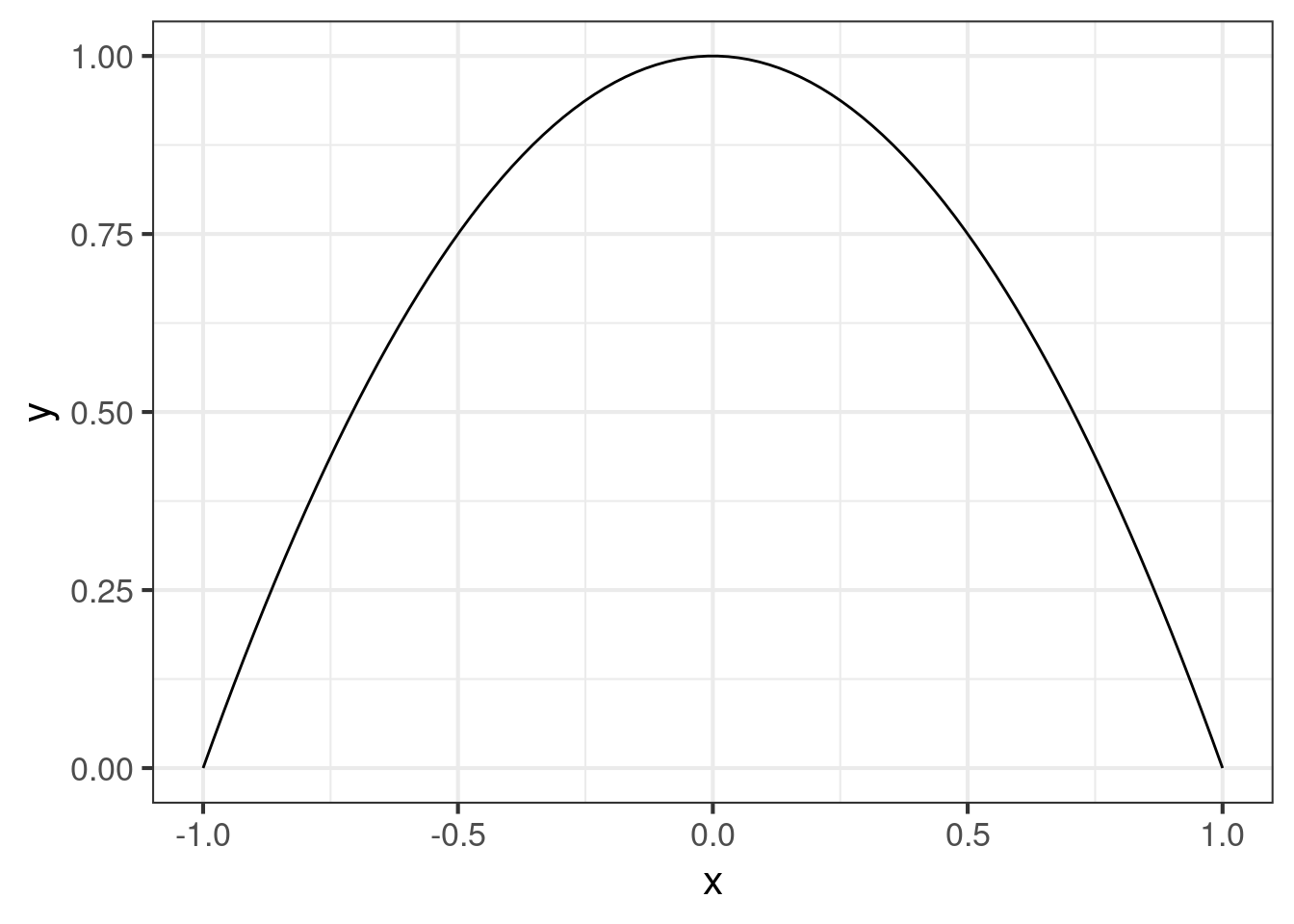
The typical box is the rectangle with length \(a\) and height \(b\). But first we need to calculate it. For simplicity, we can adopt the “2/3” rule: Use the average probability in the middle 2/3 of the curve to determine the height of the box, then set of the width of the box be the number that makes the area of the box equal to the area under the original curve.
It’s a mildly clever way to find a box that is in some sense the best simplification of the area under the curve.
typical_box <- function(x, y) {

  Curve <- approxfun(x, y)

  auc <- quadl(Curve, xa = min(x), xb = max(x))

  left <- function(val) quadl(Curve, xa = min(x), xb = val) - auc / 6
  right <- function(val) quadl(Curve, xa = val, xb = max(x)) - auc / 6

  a1 <- uniroot(left, interval = c(min(x), 0))$root
  a2 <- uniroot(right, interval = c(0, max(x)))$root

  b <- quadl(Curve, xa = a1, xb = a2) / (a2 - a1)
  a <- auc / b

  c("a" = a, "b" = b)
}
And apply it to our curve and draw the typical box:
box <- dat[, typical_box(x = x, y = y)]

ggplot(dat, aes(x = x, y = y)) +
  geom_line() +
  geom_rect(aes(xmin = -box[1] / 2, xmax = box[1] / 2,
                ymin = 0, ymax = box[2]), alpha = 0.005, fill = "blue", inherit.aes = FALSE)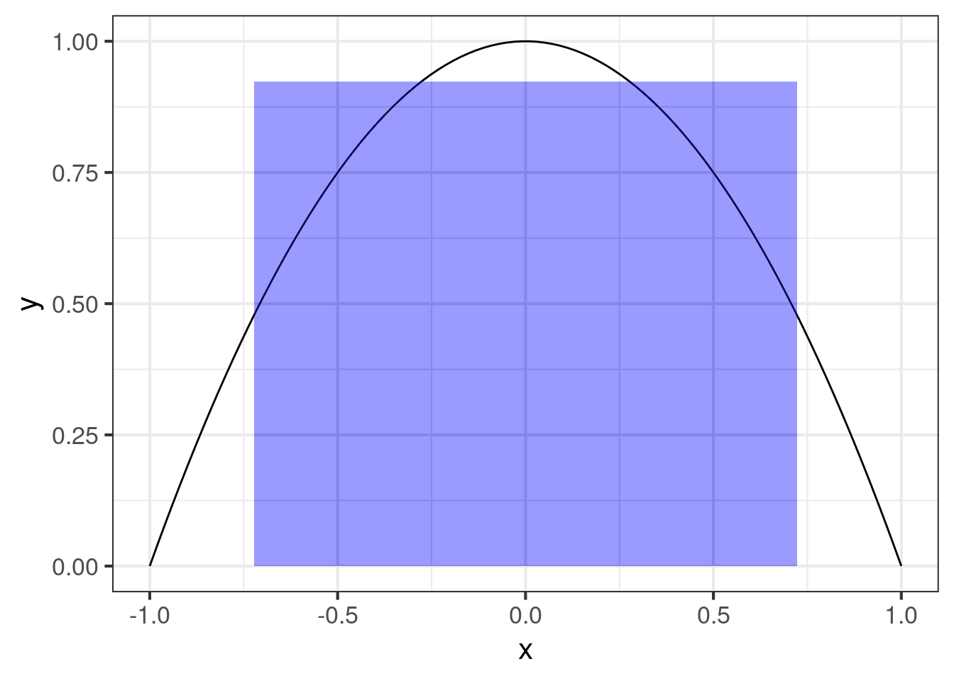
Okay, so this is all very nice, but usually we have data, and we want to find confidence intervals, so now the problem might be to find the intervals (or boxes) that bound our estimated box with some probability.
Here is an example with fake data.
dat <- data.table(x = seq(-1, 1, length.out = 100),
                  y = rbinom(100, 100, prob = rep(c(0.1, 0.3, 0.5, 0.9, 0.7,
                                                    0.6, 0.9, 0.5, 0.3, 0.1), each = 10)))


ggplot(dat, aes(x = x, y = y)) +
  geom_point()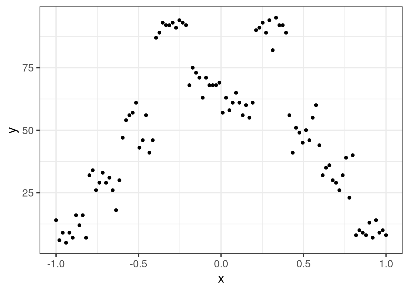
This is certainly a very nasty data set. The first task is to determine the curve of best fit to the data. Now, we could use a linear interpolater, but this wouldn’t do justice to the data if we believe the underlying curve actually varies smoothly.
Here is what the linear interpolater produces:
ggplot(dat, aes(x = x, y = y)) +
  geom_line()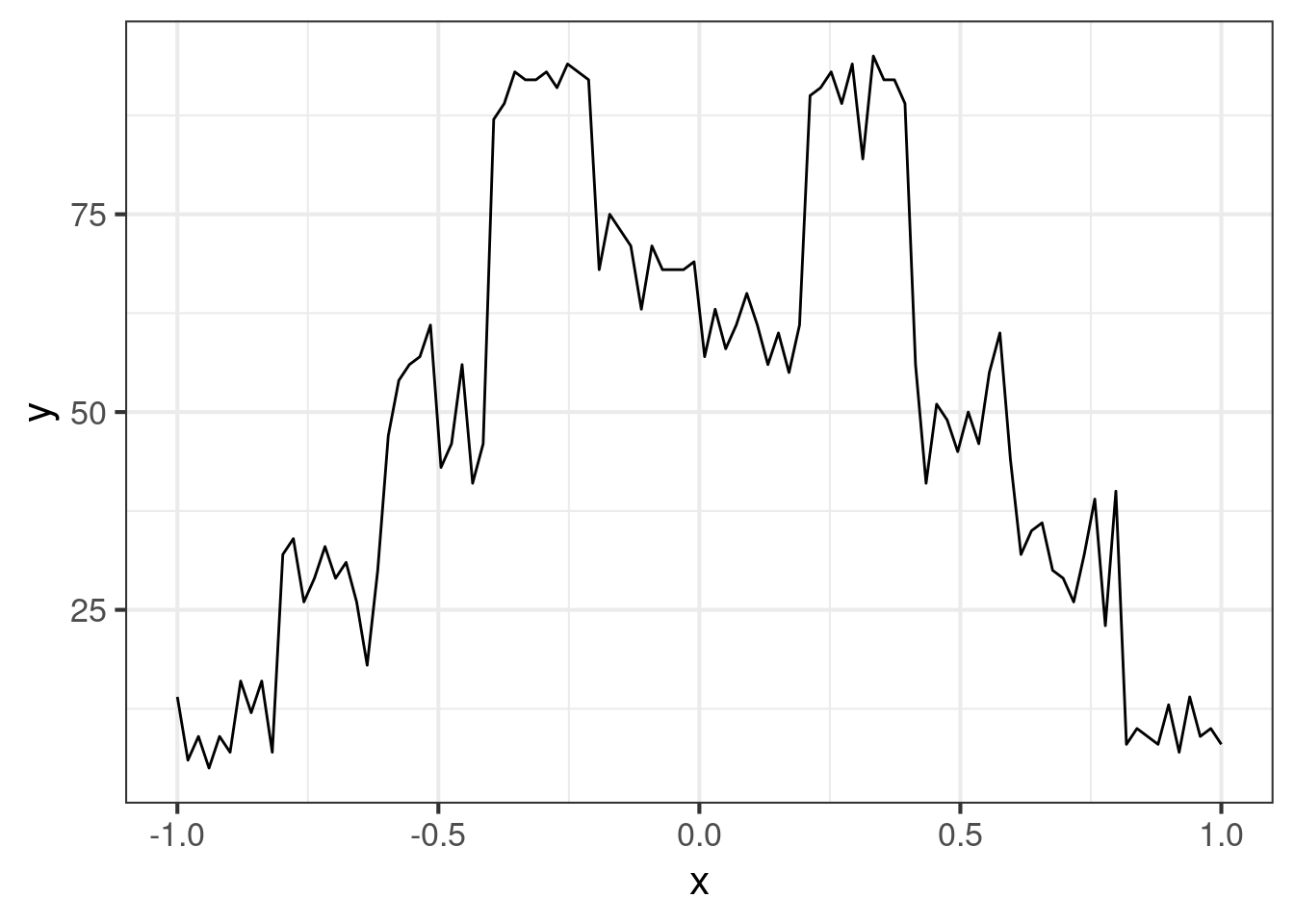
The curve is what machine learners might call “low bias, high variance”, so we have something that is not very robust to generalization. It’s much better to find something that is “medium bias, medium variance”, because “low bias, low variance” is usually out of reach. Worse yet, the curve does not admit uncertainty estimates.
Now, if we were purely interested in the typical box, probably the linear interpolater would be fine: I don’t think there could be much difference between the area under the interpolater and the area under a smoother. But since we want confidence intervals, we need to be thinking about signal and noise, which is different perspective than interpolation.
We have several options:
- Splines
- Gaussian Process
- Non-linear regression
- Polynomial regression (?)
All models have their place, but since we have probabilities (with known denominator = \(100\)), it
would be best to apply a method that fits well with the logistic regression framework. For
simplicity, we can fit a (natural) spline. This is so easy now with rstanarm :) We choose to fit the
function Bayesianly because glm() would likely produce an error due to separation.
# get data matrix ready
dat_fit <- dat[, n := 100]
dat_fit <- data.table(S = ns(dat_fit$x, 12), dat_fit)

fit <- stan_glm(cbind(y, n - y) ~ . -x,
                seed = 1,
                open_progress = FALSE,
                data = dat_fit,
                family = binomial,
                prior = student_t(3, 0, 250))
We could look at the fit statistics, but there would be nothing useful there. Splines are very interpretable without graphs, so let’s get to it.
draws <- as.data.table(posterior_predict(fit)) / 100

preds <- as.numeric(draws[, lapply(.SD, mean)])

ggplot(dat_fit, aes(x, y / 100)) +
  geom_point() +
  geom_line(aes(y = preds))
Some of the bumps are not really believable, but it took 12 spline bases to find one that would give a model that fits the highest values well. Not perfect, but it’s something we can work with. How about credible intervals (for the predictions)?
lu <- transpose(draws[, lapply(.SD, quantile, probs = c(0.05, 0.95))])

ggplot(dat_fit, aes(x, y / 100)) +
  geom_point() +
  geom_line(aes(y = preds)) +
  geom_line(data = lu, aes(x = dat_fit$x, y = V1), linetype = "dotted") +
  geom_line(data = lu, aes(x = dat_fit$x, y = V2), linetype = "dotted")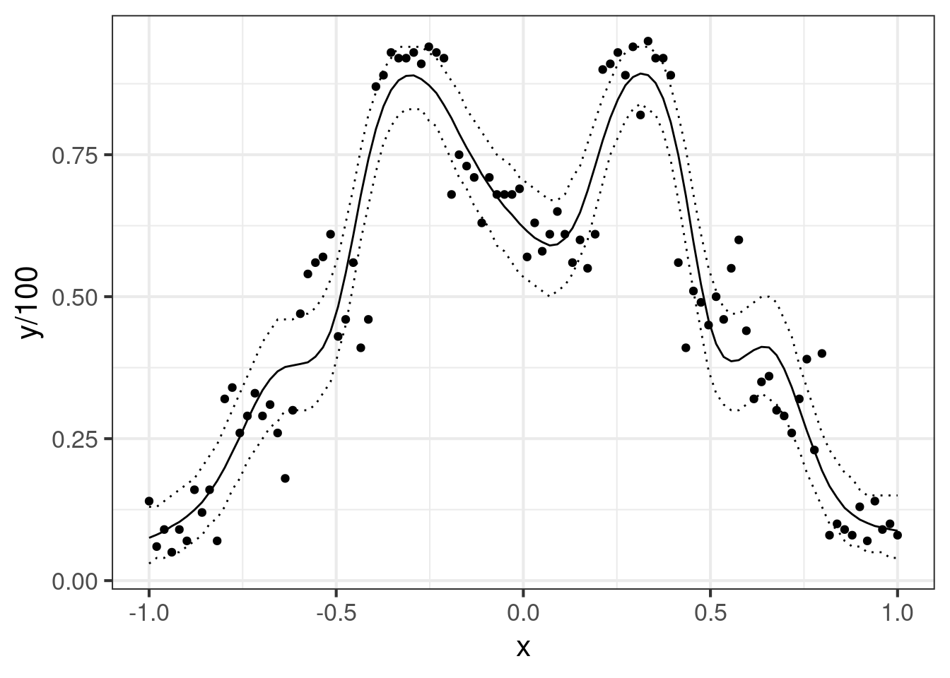
Very nice! It’s always good to get a graph of the model. I’m not sure I would call this ‘medium bias, medium variance’, but this fit looks good enough to work with, and we have the prediction intervals we need to proceed.
Finally, I will need to use MCMC samples to calculate intervals for \(a\) and \(b\). We can simply apply the algorithm to each row of the draws matrix (or rather, each column of the transposed draws matrix, because data.table operates column-wise, this is my desperate attempt to avoid a for-loop)
td <- transpose(draws)
results <- td[, lapply(.SD, typical_box, x = dat$x)] # takes a long time!

pdat <- transpose(results)
colnames(pdat) <- c("a", "b")

io <- pdat[, lapply(.SD, quantile, probs = c(0.01, 0.99))]
We can plot the “upper” and “lower” bounding boxes:
ggplot(dat_fit, aes(x = x, y = y / 100)) +
  geom_point() +
  geom_line(aes(y = preds)) +
  geom_rect(data = io, aes(xmin = -a / 2, xmax = a / 2,
                           ymin = 0, ymax = b), alpha = 0.1, fill = "green", inherit.aes = FALSE)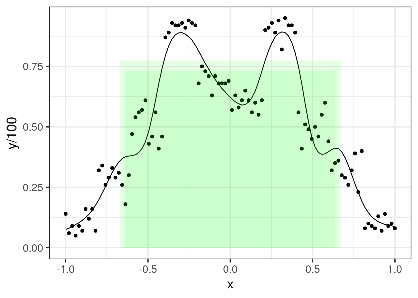
Lastly, it’s interesting to see the statistical relationship between \(a\), and \(b\). A simple scatter plot will do:
ggplot(pdat, aes(x = a, y = b)) +
  geom_point(alpha = 0.3)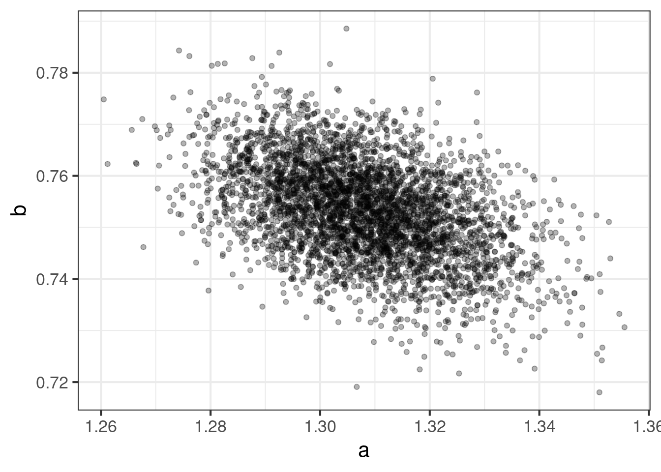
Clearly there is some correlation, but this is of no concern.
Take-away: the typical box is a derived statistic. It’s a function of an integral of a model fit.
Under classical statistics, finding a confidence region for the typical box would be extraordinarily
difficult. We would have had to bootstrap or use the delta method to work out the distribution of
\((a,b)\). In a Bayesian setting, it’s remarkably simple: we simply apply the function typical_box
to the MCMC draws of the posterior distribution. Not only is this simple, it is an exact method.