
library(nlme)
library(colorspace)
library(ggplot2); theme_set(theme_bw(base_size = 16))
It’s easy to make fun of pie charts. They get a lot of hate, but I don’t think it’s all well deserved. A pie chart can be a superior representation of the data if we want to visualize data that must sum to \(100\%\).
For analysis of variance (ANOVA), a pie chart is a good way of showing the sum of squares (SS) decomposition.
Often, this is one of the main things we want to see from an ANOVA, but the
default summary.aov in R sort of obfuscates the variance
decomposition.1.
We can write an R function that displays the anova as a ggplot pie chart. Here is an example.
First, fit an ANOVA model (linear regression model) using aov on a dataset
from the nlme package.2
## Create a model and inspect the ANOVA output
fit <- aov(yield ~ Variety + factor(nitro) * Block, Oats)
summary(fit)
## Df Sum Sq Mean Sq F value Pr(>F)
## Variety 2 1786 893 3.283 0.0465 *
## factor(nitro) 3 20020 6673 24.528 1.25e-09 ***
## Block 5 15875 3175 11.670 2.60e-07 ***
## factor(nitro):Block 15 1788 119 0.438 0.9583
## Residuals 46 12516 272
## ---
## Signif. codes: 0 '***' 0.001 '**' 0.01 '*' 0.05 '.' 0.1 ' ' 1A super important thing to note here: R’s built-in ANOVA computes type I (sequential) sums of squares. Unlike the FDA and lots of psychology journals, I think this a ‘good’ anova decomposition because
The sum of the variable sums-of-squares is equal to the model sum of squares (Unlike Type II and Type III SS)
The decomposition (along with Type II decomposition) obeys the marginality principle.
In practice, it is always important to consider the hypotheses that associate with each SS Type, so Type I is not the best for all ANOVA-type problems. But I find it’s characteristics appealing for a lot of data problems.
Despite these ‘upsides’ to Type I SS, it is not popular because the SS
decomposition depends on the order variables are entered into the model. For
example, the SS decomposition for income ~ gender + education won’t be the
same as income ~ education + gender, unless gender and income are
orthogonal, which is one reason R recommends aov for the analysis of balanced
data.
When the data are not balanced, our strategy is to enter the most important ‘explainers’ into the model first. This is because the sums-of-squares of later model terms are conditional on what came before them. Here is an example Type I SS decomposition:
| Term | Type I SS |
|---|---|
A |
SS(A) |
B |
SS(A|B) |
A:B |
SS(A:B|A,B) |
From the table, the SS of factor B, if entered into the ANOVA model after A, is
only the SS leftover after calculating the SS for A. Similarly, the SS for A:B
is only the SS leftover after calculating SS(A) and SS(B|A).
While this all sounds unfortunate, it has the upside of forcing us to think about which terms should be important, and how to allocate the SS in non-orthogonal experiments.
Back to example:
## Extract SS from the anova table
s <- summary(fit)[[1]]$`Sum Sq`

## Calculate % explained attributable to each varible, keeping in mind the
## possible assumptions and limitations of this exercise
pct <- s / sum(s) * 100

## Make a data.frame for plotting
df <- data.frame(
  x = rownames(summary(fit)[[1]]),
  pct = pct)
Finally, due to the fact that Type I SS preserve the heralded SSR + SSE = SST
relationship, we may make a pie graph of the ‘variance explained’ by factor
ggplot(df, aes(x = "", y = pct, fill = x)) +
  geom_bar(stat = "identity", width = 1, color = "white", size = 1) +
  geom_text(aes(label = paste0(round(pct), "%")),
            position = position_stack(vjust = 0.5), size = 4) +
  coord_polar("y") +
  scale_fill_discrete_qualitative() +
  theme_void(base_size = 16) +
  guides(fill = guide_legend(nrow = 2)) +
  theme(legend.position = "top")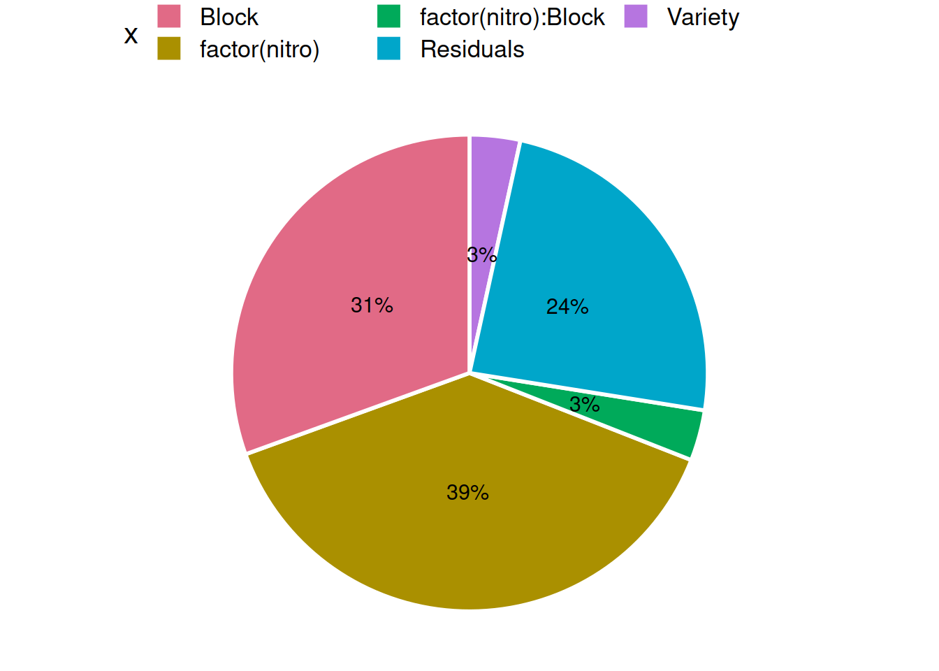
To my eyes, the picture would not look as nice if I’d made a bar graph, since I know all the SS terms must sum to SST.
I do not endorse this approach for all ANOVA problems. But I do enjoy this exercise as another feather in my ‘ANOVA is not the same as linear regression’ cap.