
Calibration curves are a useful little regression diagnostic that provide a nice goodness of fit measure. The basic idea behind the diagnostic is that if we plot our estimated probabilities against the observed binary data, and if the model is a good fit, a loess curve1 on this scatter plot should be close to a diagonal line.
The key advantage of calibration curves is that they show goodness of fit in an absolute sense. That is, they answer the question “Is this model good?”. This is more useful than the usual model checking statistics, that instead answer the question “Is model A better than model B?”. In the latter case, maybe model A is better than B, but model A still may well be just a bad model.2
Let’s get started with some data, and a model:
set.seed(124)
library(ggplot2); theme_set(theme_bw(base_size = 14))

dat <- lme4::InstEval
dat <- dat[sample(nrow(dat), 1000), ]

fit <- glm(y > 3 ~ studage + lectage + service + dept, binomial, dat)
The InstEval dataset is a collection of instructor evaluation scores from ETH
Zurich. The point of the model is to predict whether an instructor will be given
a score greater than 3 by her students. The covariates chosen are student age,
instructor age, service, and department. There are other variables in the data,
and the reader can investigate by issuing ?InstEval.
The summary table is large, so I will omit it from the output.
It’s always good to check the model before we make inferences. This is an effective strategy that prevents \(p\)-hacking, but still gives us a chance to find a good model without poisoning conclusions.
Here is the code to draw the calibration curve:
We require a data frame with just the predictions and observed 0s and 1s.
pdat <- with(dat, data.frame(y = ifelse(y > 3, 1, 0),
                             prob = predict(fit, type = "response")))
ggplot(pdat, aes(prob, y)) +
geom_point(shape = 21, size = 2) +
geom_abline(slope = 1, intercept = 0) +
geom_smooth(method = stats::loess, se = FALSE) +
scale_x_continuous(breaks = seq(0, 1, 0.1)) +
scale_y_continuous(breaks = seq(0, 1, 0.1)) +
xlab("Estimated Prob.") +
ylab("Data w/ Empirical Prob.") +
ggtitle("Logistic Regression Calibration Plot")## `geom_smooth()` using formula 'y ~ x'
Recall that if the blue smooth is close to a diagonal, then the model is internally calibrated to the data3. In the case of this model, we actually see pretty good agreement between data and estimate across the range of possible predictions.
Calibration curves can be further extended to estimate out of sample
calibration via a bootstrapping procedure. This is even better, but we might
most easily use the rms library to do this.
library(rms)

refit <- lrm(y > 3 ~ studage + lectage + service + dept, dat, x = TRUE, y = TRUE)
plot(calibrate(refit, B = 400))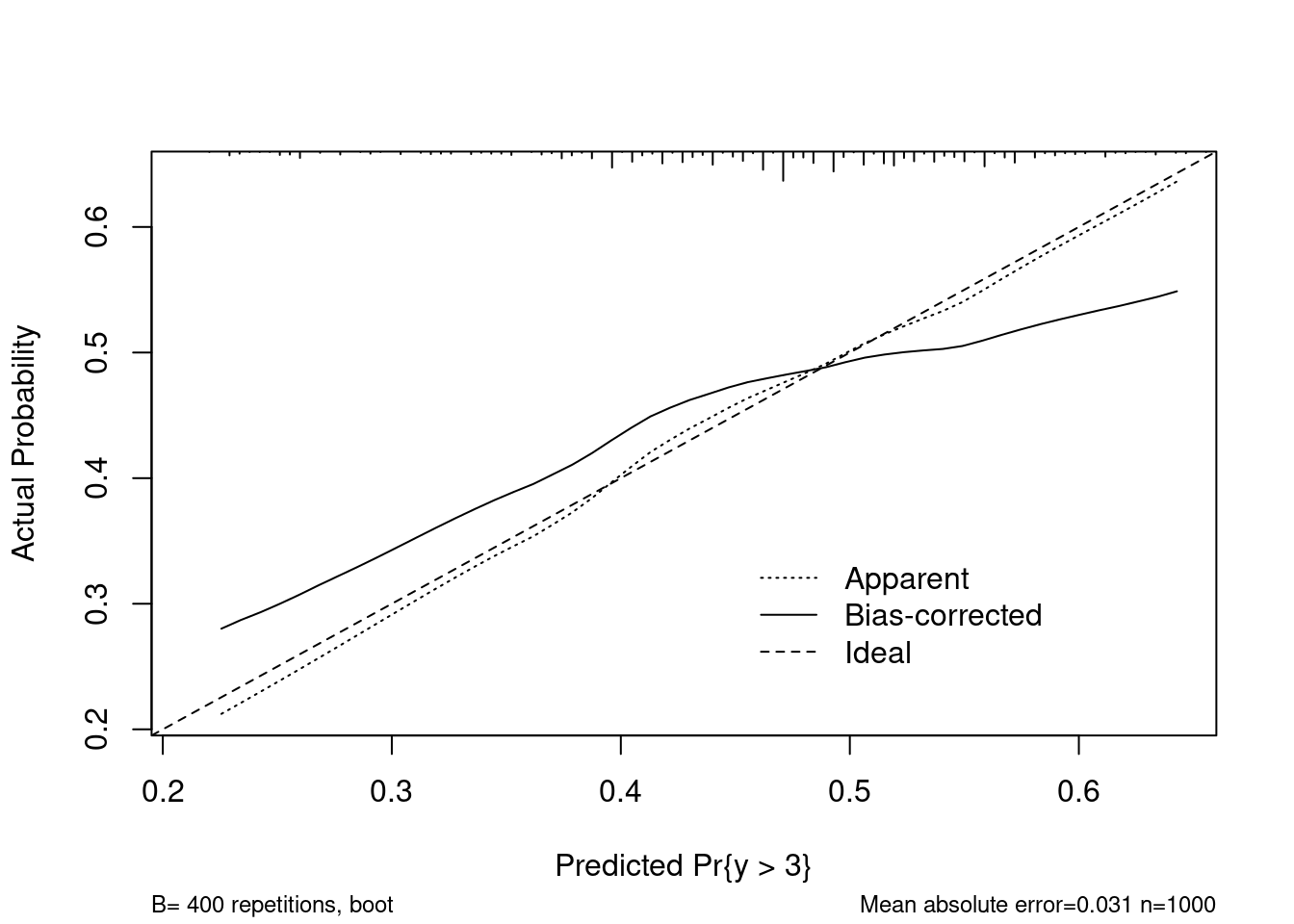
##
## n=1000   Mean absolute error=0.031   Mean squared error=0.00131
## 0.9 Quantile of absolute error=0.053
The calibrate function from rms graphs both internal and external
calibration. Our estimate of internal calibration above closely matches what is
shown using calibrate, but the external (aka bias corrected) measure shows
that the model may not be suitable for predicting on new data.