I received the following email:
From the World Health Organization, The latest Murder Statistics for the world: Murders per 100,000 citizens per year. Honduras 91.6 (WOW!!) El Salvador 69.2, … [the rest of the numbers I omit], Suriname 4.6, Laos 4.6, Georgia 4.3, Martinique 4.2, And ……….The United States 4.2, ALL (109) of the countries above America, HAVE 100% gun bans. It might be of interest to note that SWITZERLAND is not shown on this list, because it has… NO MURDER OCCURRENCE! However, SWITZERLAND ’S law requires that EVERYONE: 1. Own a gun. 2. Maintain Marksman qualifications … regularly. Did you learn anything from this?? I think the message is - loud and clear…
According to the email, there is a clear relationship between gun bans, and the murder rate. I don’t much trust email statistics (or much of any research that I didn’t do myself) so I’d like to confirm or deny some of the main points.
I can’t sift data on gun laws for every country in a reasonable amount of time, but I can look at firearm prevalence per country.
library(rvest)
library(data.table)
library(ggplot2); theme_set(theme_dark(base_size = 15))
library(colorspace)
Wikipedia maintains data on both gun prevalence and murder rates for countries:
The first step is to download the webpages that contain the relevant data:
guns_url <- "https://en.wikipedia.org/wiki/Estimated_number_of_civilian_guns_per_capita_by_country"
murders_url <- "https://en.wikipedia.org/wiki/List_of_countries_by_intentional_homicide_rate"

guns_page <- read_html(guns_url)
murders_page <- read_html(murders_url)
Next we suck the data out of the web pages into data frames. I’m very impressed
by how easy this is now with rvest.
guns_table <- guns_page %>%
  html_nodes("table.wikitable") %>%
  html_table(header = TRUE) %>%
  as.data.table()

murders_table <- murders_page %>%
  html_nodes("table.wikitable") %>%
  html_table(header = TRUE)

## Many tables on this page, only need one
murders_table <- murders_table[[3]] %>% as.data.table()

## Clean the column names
names(murders_table) <- c("Country", "Region", "Subregion", "Murder Rate", "Count", "Year Listed")

names(guns_table) <- c("X", "Country", "Gun Rate", "Region", "Subregion", "Population",
                       "Count_Firearms_Civ", "Method", "Registered Firearms", "Unregistered Firearms", "Notes")
Let’s bind the two tables together.
setkey(murders_table, Country)
setkey(guns_table, Country)

merge_data <- guns_table[murders_table]
merge_data[, Population := as.numeric(gsub(",", "", Population))]
First, the raw data:
p <- ggplot(merge_data, aes(x = `Gun Rate`, y = `Murder Rate`, color = Region)) +
  geom_point(size = 2) +
  scale_color_discrete_divergingx() +
  xlab("Number of firearms per 100 people") +
  ylab("Number of murders per 100,000 people") +
  theme(legend.position = "bottom")
print(p)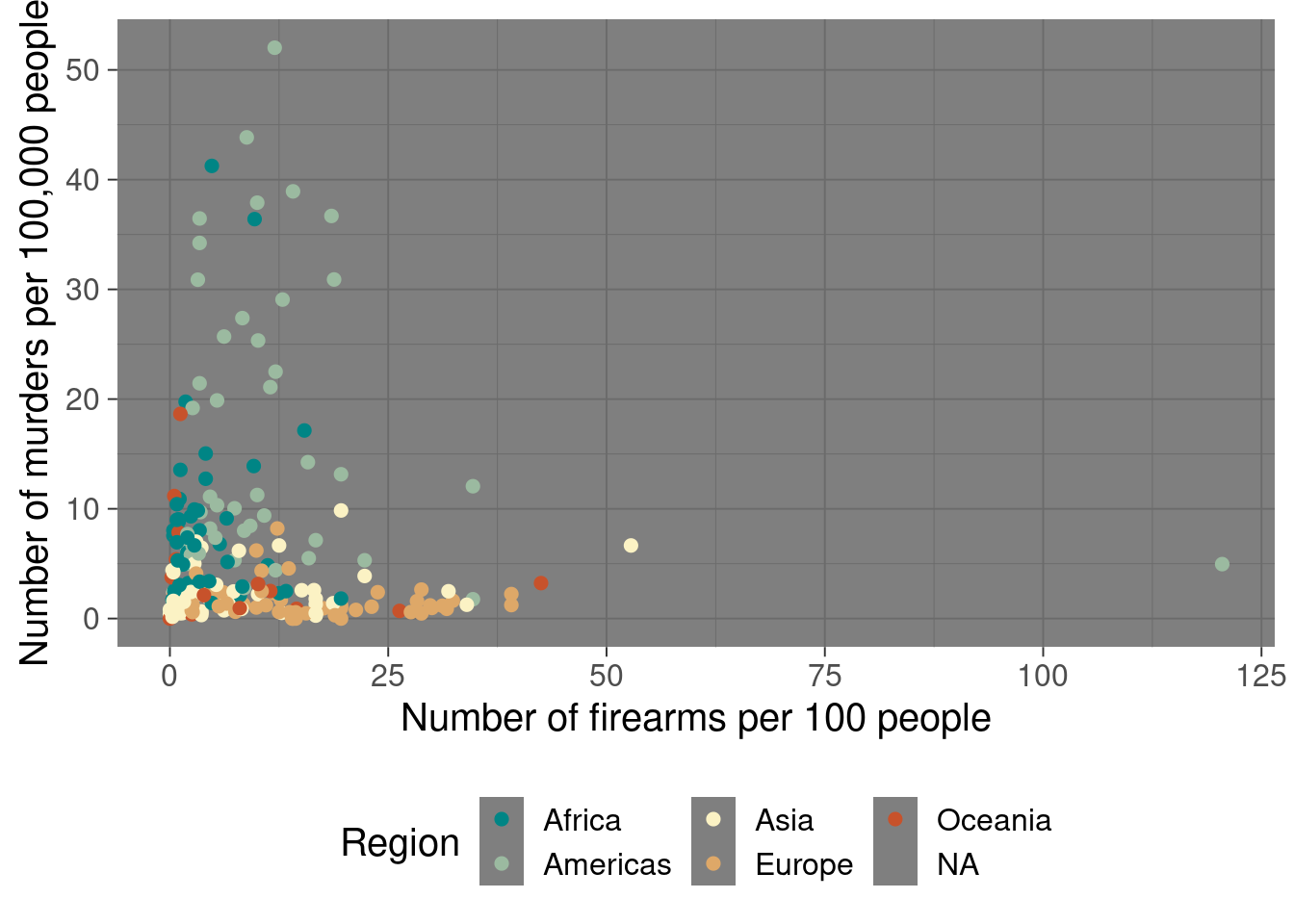
Try again on the log-scale, much better picture:
p2 <- p + scale_x_log10() +
  scale_y_log10() +
  geom_smooth(se = FALSE) +
  geom_text(aes(label = ifelse(Population > quantile(Population, 0.95, na.rm = TRUE), Country, "")),
            size = 5, show.legend = FALSE)
print(p2)
## `geom_smooth()` using method = 'loess' and formula 'y ~ x'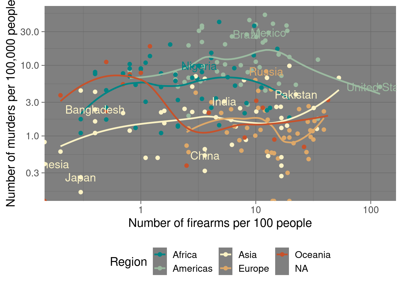
America is rather extraordinary in terms of firearm prevalence, but it is actually middle-of-the-pack in terms of murders. The United States looks relatively safe compared to other countries in the Americas, but much more dangerous compared to the average European or Asian country. Overall, the trends for the Americas and Africa are far worse than Asia and Europe, because the data is plotted on the log scale.
But I would not be so quick to say that there is a link between guns and murders.
The Oceanic countries are interesting: Oceanic countries with fewer firearms per citizen look more like the Americas or Africa. But Oceanic countries with more firearms start to look more like Europe or Asia. The data is pretty thin, so I wouldn’t think too hard about it.
Obviously, this is a big, complex issue, that is best understood by conditioning on all the important variables, which we didn’t do in this post!
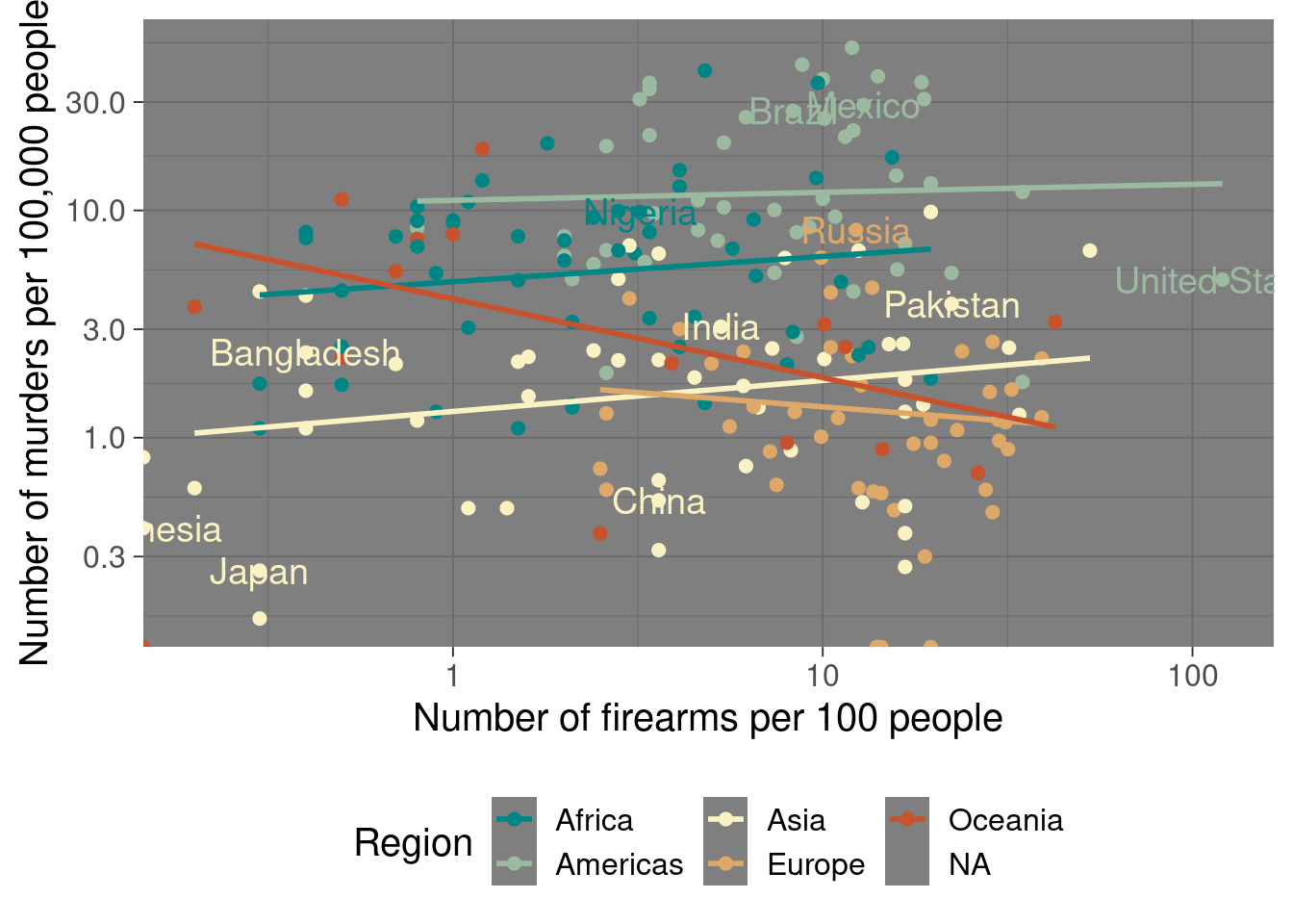
We can finally try a linear trend:
p3 <- p + scale_x_log10() +
  scale_y_log10() +
  geom_smooth(method = "lm", se = FALSE) +
  geom_text(aes(label = ifelse(Population > quantile(Population, 0.95, na.rm = TRUE), Country, "")),
            size = 5, show.legend = FALSE)
print(p3)
## `geom_smooth()` using formula 'y ~ x'