
Directional data, data collected on the surface of a sphere or circle, is rather common in certain lines of work. There are several approaches to handling this data, but a most satisfying approach is to adopt a directional statistics mindset, which respects the topology of the sphere or circle.
However, visualizing spherical data in R is challenging. R is exceptional for
making two-dimensional Cartesian visualizations, but these can distort the
geometry of the sphere. The post will show you how to use ggplot to make some
cool visuals on a sphere, without messing up the geometry.
First, we take some fake data. The library Directional is great for this.
library(data.table)
library(ggplot2); theme_set(theme_bw(base_size = 15))
library(colorspace)
library(Directional)
dat <- rvmf(200, mu = c(1, 2, 0) / sqrt(5), k = 3)
dat <- setDT(data.frame(dat)); colnames(dat) <- c("x", "y", "z")Looks like Directional is giving back data in Cartesian coordinates.
plot(dat,
     xlim = c(-1, 1),
     ylim = c(-1, 1),
     asp = 1)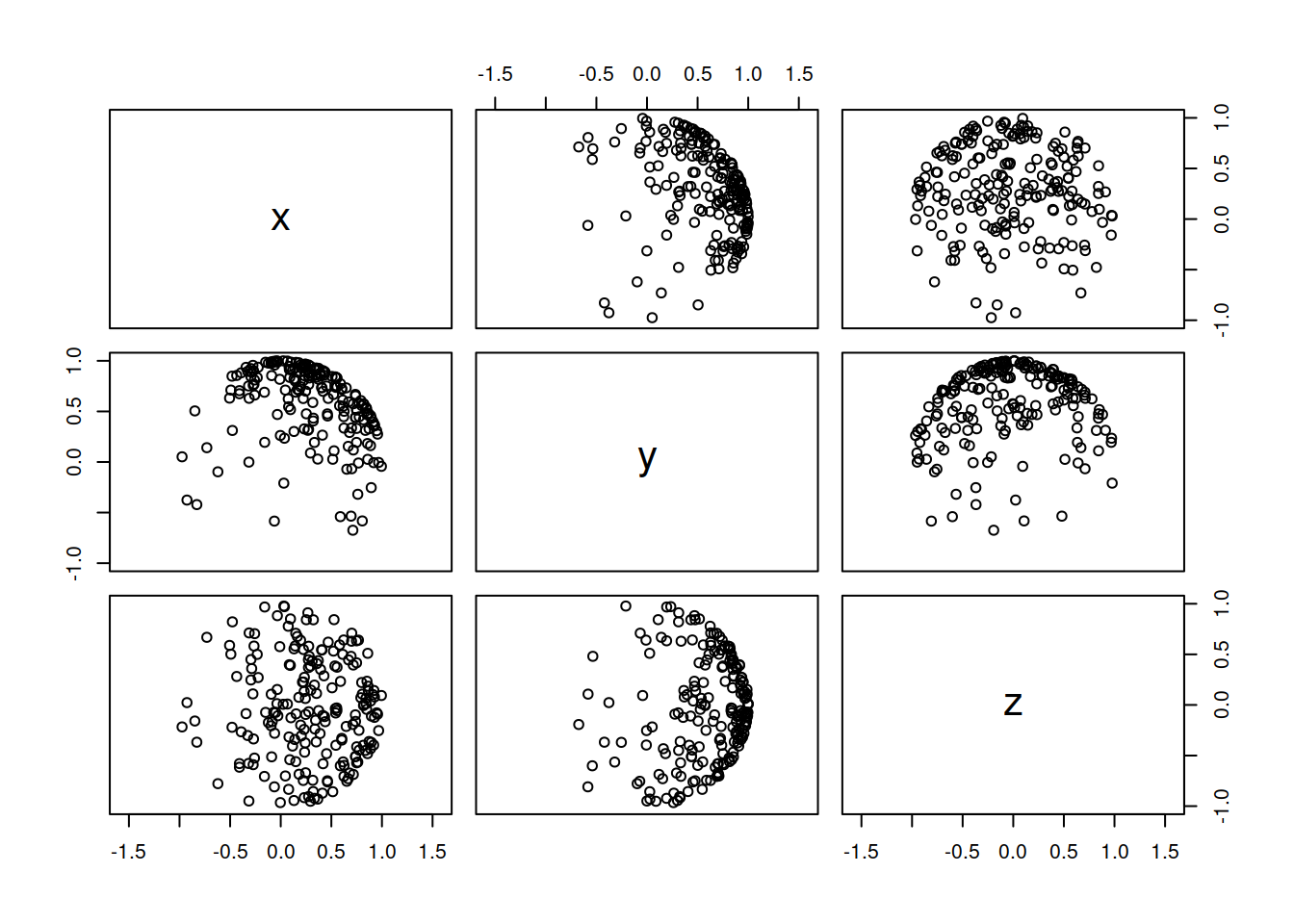
Convert to Lat/Long coordinates, which is the expected format for a lot of packages.
dat[, long := atan2(y, x) * (180 / pi) + 180][, lat := acos(z) * (180 / pi)]Fit a kernel density estimate to the data, using Directional package.
dens <- vmf.kerncontour(dat[, .(lat, long)], ngrid = 300, full = TRUE, thumb = "rot", den.ret = TRUE)Here is a 2D version of the density estimate.
with(dens, image(x = long, y = lat, z = den,
                 main = "Spherical Density Estimate",
                 xlab = "Longitude",
                 ylab = "Latitude"))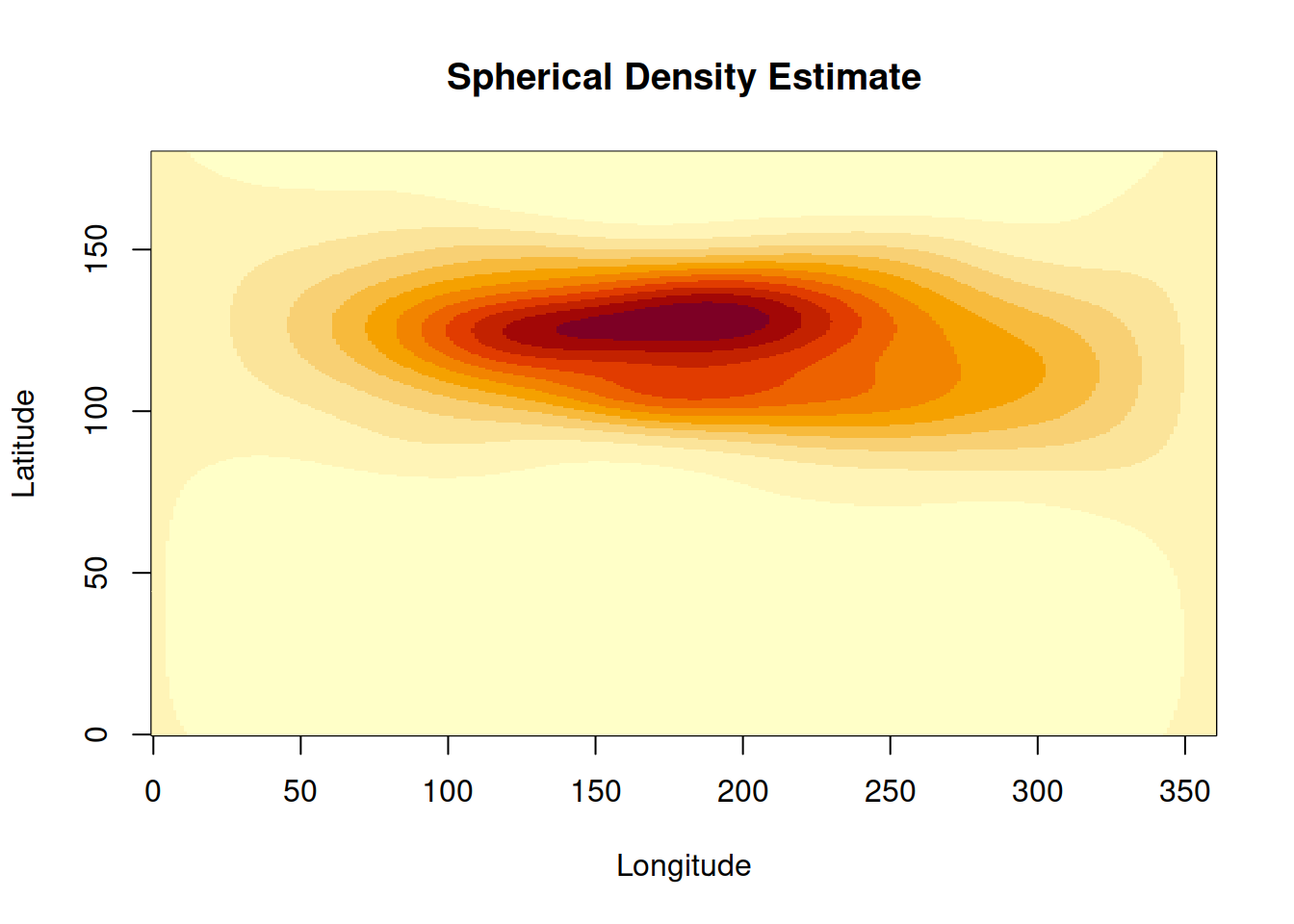
While the image is a nice way to show the contours, I would personally rather see the data on the surface of a sphere, and even better if I can do it with ggplot.
The main ggplot trick is to use coord_map(). The secondary trick is to avoid
contour type plotting functions, and instead go for a dense grid of
geom_points. The final trick is to bring the panel grid to the foreground,
which makes things look just a bit nicer.
First, convert the dens matrix to a data.frame that is amenable to ggplotting.
pdat <- data.table(d = c(dens$den),
                   lat = rep(dens$lat, each = 300) - 90,
                   long = rep(dens$long, 300) - 180)
And now the final ggplot. Here is one angle:
ggplot(pdat, aes(x = long, y = lat, color = d)) +
  geom_point() +
  scale_color_continuous_sequential(palette = "YlOrRd") +
  coord_map("orthographic", orientation = c(20, 0, 0)) +
  scale_x_continuous(breaks = seq(-180, 180, 20)) +
  scale_y_continuous(breaks = seq(-90, 90, 45)) +
  ggtitle("Orthographic Projection of Spherical Density", "Top / Front View") +
  xlab("") +
  ylab("") +
  theme(axis.ticks = element_blank(),
        axis.text = element_blank(),
        panel.ontop = TRUE,
        legend.position = "none",
        plot.title = element_text(hjust = 0.5),
        plot.subtitle = element_text(hjust = 0.5),
        panel.grid = element_line(color = "black"),
        panel.background = element_rect(fill = NA))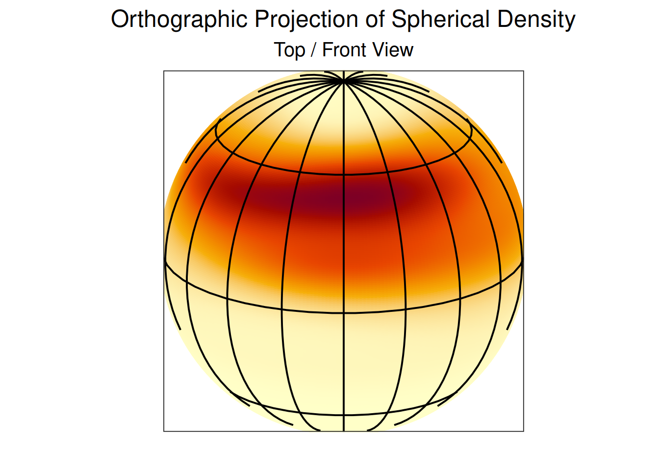
And another view from a different angle:
ggplot(pdat, aes(x = long, y = lat, color = d)) +
  geom_point() +
  scale_color_continuous_sequential(palette = "YlOrRd") +
  coord_map("orthographic", orientation = c(-20, 180, 0)) +
  scale_x_continuous(breaks = seq(-180, 180, 20)) +
  scale_y_continuous(breaks = seq(-90, 90, 45)) +
  ggtitle("Orthographic Projection of Spherical Density", "Bottom / Back View") +
  xlab("") +
  ylab("") +
  theme(axis.ticks = element_blank(),
        axis.text = element_blank(),
        panel.ontop = TRUE,
        legend.position = "none",
        plot.title = element_text(hjust = 0.5),
        plot.subtitle = element_text(hjust = 0.5),
        panel.grid = element_line(color = "black"),
        panel.background = element_rect(fill = NA))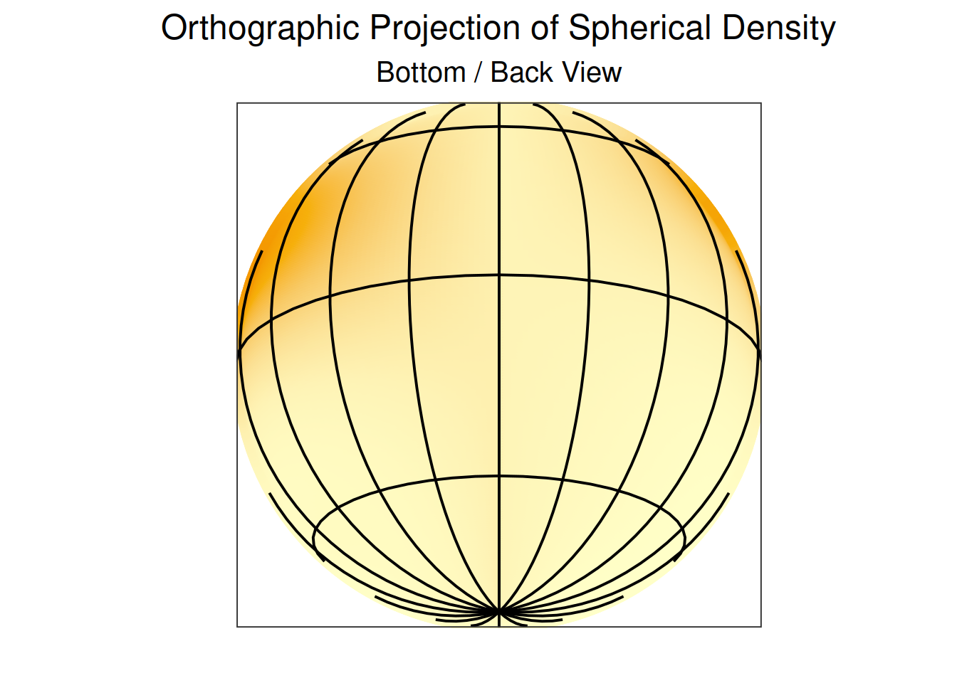
Many other map projections are available in mapproj package.