 by NASA's Marshall Space Flight Center is licensed with CC BY-NC 2.0. To view a copy of this license, visit https://creativecommons.org/licenses/by-nc/2.0/")
library(ggplot2); theme_set(theme_bw(base_size = 14))
library(rms)
In the last post, we saw how to fit a bias-corrected calibration curve using the
rms package. In this post we see how to do the same thing without loading the
rms package. Of course, we need a model to start things off.
set.seed(125)
dat <- lme4::InstEval[sample(nrow(lme4::InstEval), 800), ]
fit <- glm(y > 3 ~ lectage + studage + service + dept, binomial, dat)
In trying to reproduce my own version of calibrate, I am a bit disappointed
that the documentation for calibrate does not provide any references. That
means this must be easy!
First let’s recall that calibration can be internal or external. If a model is internally calibrated, then (say) if the model predicts \(Pr\{\textrm{outcome}|\textrm{covariates}\} = 0.2\), then the outcome occured darn close to 20% of the time in the training data given the covariates. Replace 20% with the range of possible predictions that the model could make, and you’ve got calibration over the range of possible outcomes. The makes calibration curves broadly useful for regression modeling.
This is nice, but misleading, because optimal internal calibration means the model is likely overfitted. We have to do some extra work to correct for this easy trap.
External calibration is the solution. If a model is externally calibrated then it is calibrated to new, unseen data. My fascination with (external) calibration is three-fold:
Calibration measures model performance without using accuracy, or other improper scoring rules.
No new data is actually required to estimate external calibration. We can do so nearly unbiasedly using a bootstrap procedure.
Calibration is best diagnosed with graphs, rather than simple summaries and hypothesis tests.
Like the previous post, we can simply plot internal calibration using ggplot2:
pdat <- with(dat, data.frame(y = ifelse(y > 3, 1, 0),
                             prob = predict(fit, type = "response")))

apparent.cal <- data.frame(with(pdat, lowess(prob, y, iter = 0)))
p <- ggplot(pdat, aes(prob, y)) +
geom_point(shape = 21, size = 2) +
geom_abline(slope = 1, intercept = 0) +
geom_line(data = apparent.cal, aes(x, y), linetype = "dotted") +
scale_x_continuous(breaks = seq(0, 1, 0.1)) +
scale_y_continuous(breaks = seq(0, 1, 0.1)) +
xlab("Estimated Prob.") +
ylab("Data w/ Empirical Prob.") +
ggtitle("Logistic Regression Calibration Plot")
print(p)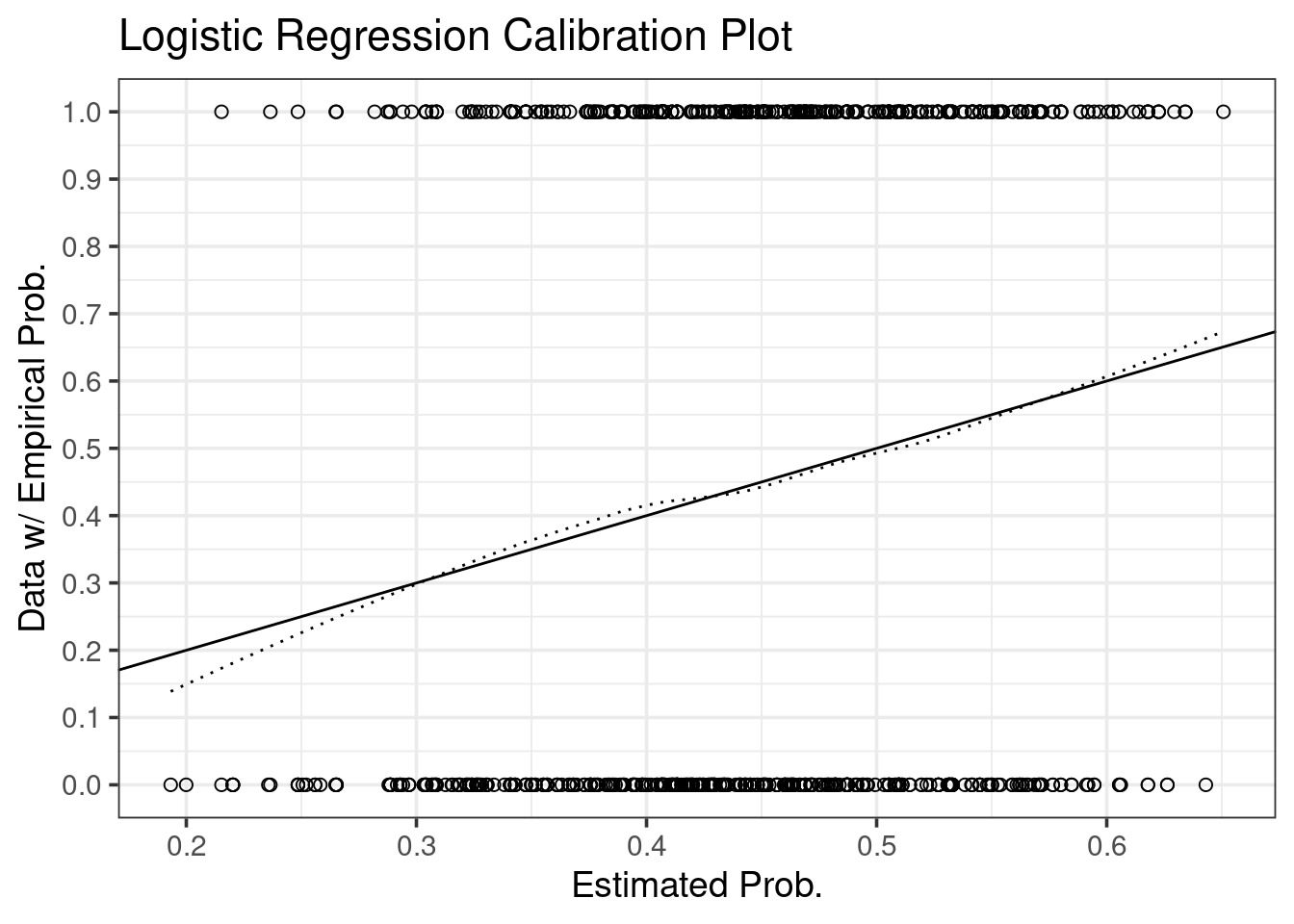
To transfer from internal calibration to external calibration, we need to correct the dotted smoother for bias.
Harrell describes the application of this process to the calibrate function in
the RMS book:
The calibrate function produces bootstrapped or cross-validated calibration curves for logistic and linear models. The “apparent” calibration accuracy is estimated using a nonparametric smoother relating predicted probabilities to observed binary outcomes. The nonparametric estimate is evaluated at a sequence of predicted probability levels. Then the distances from the 45 degree line are compared with the differences when the current model is evaluated back on the whole sample (or omitted sample for cross-validation). The differences in the differences are estimates of overoptimism. After averaging over many replications, the predicted-value-specific differences are then subtracted from the apparent differences and an adjusted calibration curve is obtained.
I actually think he makes it too complicated: We need not compare distances from the 45 degree line, we can just compare smoother outputs at each prediction. In other word, the complicated differences in differences are simply differences.1
Getting this right is tricky. A somewhat simpler explanation is given On this blog.
Here is the procedure in code. First, we need to collect some useful
pre-simulation variables: We can calculate the apparent calibration outside the
simulation loop, so we do so, and call it app.cal.pred. We also need the set
the number of simulations, nsim, and (for efficiency) create a matrix to store
simulation data.
## Range of inputs on which to calculate calibrations
srange <- seq(min(pdat$prob), max(pdat$prob), length.out = 60)

## Discard the smallest and largest probs for robustness, and agreement with rms::calibrate
srange <- srange[5 : (length(srange) - 4)]

## The apparent calibration is determined by this loess curve.
apparent.cal.fit <- with(pdat, lowess(prob, y, iter = 0))
app.cal.fun <- approxfun(apparent.cal.fit$x, apparent.cal.fit$y)
app.cal.pred <- app.cal.fun(srange)

## Number of bootstrap replicates
nsim <- 300

## Storage for bootstrap optimism (one row per bootstrap resample)
opt.out <- matrix(NA, nsim, length(srange))
Here is the real simulation. The steps are as in link from TheStatsGeek.
Simulation steps:
Fit model to original data, and estimate a statistic, \(C\), using original data based on fitted model. Denote this as \(C_{app}\).
For \(b=1,\ldots,B\):
Take a bootstrap sample from the original data.
Fit the model to the bootstrap data, and estimate \(C\) using this fitted model and this bootstrap dataset. Denote the estimate by \(C_{b,boot}\).
Estimate \(C\) by applying the fitted model from the bootstrap dataset to the original dataset. Denote this estimate by \(C_{b, orig}\).
Calculate the estimate of optimism: \(O = B^{-1} \sum_{b=1}^B \{ C_{b,boot} - C_{b,orig } \}\).
Calculate the bias corrected version of \(C\), \(C_{b.c.} = C_{app} - O\).
for (i in 1 : nsim) {

  ## Sample bootstrap data set from original data
  dat.boot <- dat[sample(nrow(dat), nrow(dat), TRUE), ]

  ## Fit logistic model using the bootstrap data
  fit.boot <- update(fit, data = dat.boot)

  ## Make a DF of the bootstrap model and bootstrap predictions
  pdat.boot <- data.frame(y = ifelse(dat.boot$y > 3, 1, 0),
                          prob = predict(fit.boot, dat.boot, type = "response"))

  ## Fit a calibration curve to the bootstrap data
  boot.cal.fit <- with(pdat.boot, lowess(prob, y, iter = 0))
  boot.cal.fun <- approxfun(boot.cal.fit$x, boot.cal.fit$y)

  ## Collect a set of them for comparison
  boot.cal.pred <- boot.cal.fun(srange)

  ## Apply the bootstrap model to the original data
  prob.boot.orig <- predict(fit.boot, dat, type = "response")

  ## Make a DF of the boot model predictions on original data
  pdat.boot.orig <- data.frame(y = ifelse(dat$y > 3, 1, 0),
                               prob = prob.boot.orig)

  ## Fit a calibration curve to the original data w/ boot model predictions
  boot.cal.orig.fit <- with(pdat.boot.orig, lowess(prob, y, iter = 0))
  boot.cal.orig.fun <- approxfun(boot.cal.orig.fit$x, boot.cal.orig.fit$y)

  ## Collect a set of them for comparison
  boot.cal.orig.pred <- boot.cal.orig.fun(srange)

  ## Take the difference for estimate of optimism
  opt <- boot.cal.pred - boot.cal.orig.pred
  opt.out[i, ] <- opt
}
## The bias corrected calibration curve is the apparent calibration less the average bootstrap optimism
bias.corrected.cal <- app.cal.pred - colMeans(opt.out)We again make the calibration with ggplot, no rms required.
ppdat <- data.frame(srange, app.cal.pred, bias.corrected.cal)

ggplot(ppdat, aes(srange, app.cal.pred)) +
  geom_line(linetype = "dotted", color = "black") +
  geom_line(aes(y = bias.corrected.cal), color = "black") +
  geom_abline(slope = 1, intercept = 0, linetype = "dashed", color = "black") +
  scale_x_continuous(breaks = seq(0, 1, 0.1)) +
  scale_y_continuous(breaks = seq(0, 1, 0.1)) +
  xlab("Estimated Prob.") +
  ylab("Empirical Prob.") +
  ggtitle("Logistic Regression Calibration Plot")
## Warning: Removed 7 row(s) containing missing values (geom_path).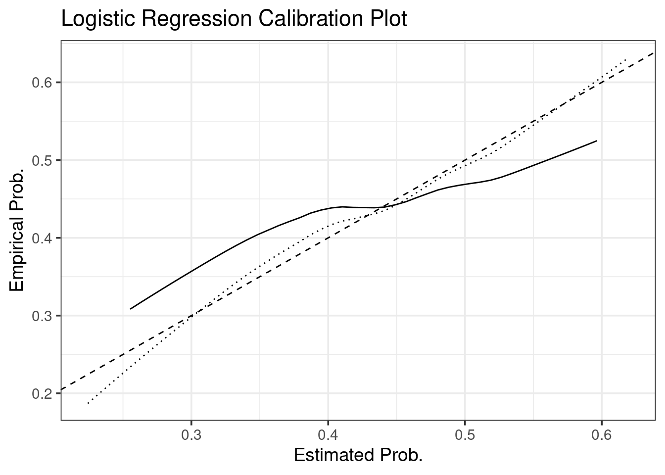
Compare with rms::calibrate:
refit <- lrm(y > 3 ~ lectage + studage + service + dept, dat, x = TRUE, y = TRUE)
cal <- calibrate(refit, B = 300)
plot(cal)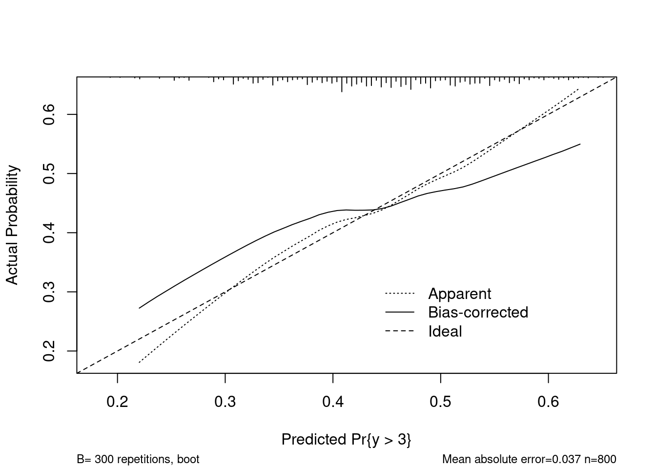
##
## n=800   Mean absolute error=0.037   Mean squared error=0.00177
## 0.9 Quantile of absolute error=0.059
Damn near perfect match :)
Last note: While I think this is close, I don’t actually think I’ve perfectly
replicated calibrate. For example, I’m not sure how calibrate is handling
missing values from the lowess smoother.2